The Graphical User Interface: An Introduction
Bernard J. Jansen Computer Science Program University of Maryland (Asian Division) Seoul, 140-022 Korea Email: jjansen@acm.org
Please Cite: Jansen, B. J. 1998. The Graphical User Interface: An Introduction . SIGCHI Bulletin. 30(2), 22-26.
I. INTRODUCTION
II. GUI
A. DEFINITION
B. HISTORY
C. DE FACTO STANDARD1. Apple Macintosh
2. IBM SAA
3. MIT X-Windows System
A. AMOUNT OF INFORMATION PRESENTED
B. GROUPING OF INFORMATION
C. INFORMATION SEQUENCIN
V. RAMIFICATIONS
VI. CONCLUSION
VII. REFERENCES
Go to Publication and Reference List
There are a variety of university-level computer-human interaction (CHI) programs. Although a few offer breath and diversity, many students graduate from universities that offer only one or two CHI courses. As such, most students have a limited background in the various CHI areas. This article offers a general overview in one area, graphical user interfaces (GUI). A GUI allows a computer user to move from application to application [26]. A good GUI makes an application easy, practical, and efficient to use, and the marketplace success of today's software programs depends on good GUI design. Consider the Macintosh and the IBM-PC. Computer users view Apple's Macintosh computers as having the best GUI. Correspondingly, their positive view of the Macintosh system is almost double that of the Windows users [1]. Correspondingly, brand loyalty among Macintosh users is almost 20% higher than that for Windows users [26].
The development of a new software is extremely expense. With success or failure of a product and maybe the entire company dependent on the application's GUI reception in the marketplace, a good GUI design is extremely important. Unfortunately, it is not easy to define if an application's GUI is easy, practical, or efficient. These are attributes that do not lend themselves to counting. The marketplace does attempt to access these attributes, however [6], but even after over 10 years of GUI development, there are still questions concerning what is a good GUI design.
For example, the early Macintosh Apple used the Trash Can icon as a metaphor for deleting files. However, one can pull items out of a trash can until the trash person comes. The first trash can icon did not allow this retrieval. This contextual incongruity caused users many problems. As another example, the Windows'95 GUI is the most modern of all GUI. One would expect it to be fairly well developed and relatively error free. However, of the approximately 90 complaints with the Windows'95, none are performance complaints. They are all human factors type complaints, such as how to copy a file and how to get rid of annoying icons [25]. Finally, people have so many complaints about the X-Windowing System, the third major GUI standard, that there is whole book about what is wrong with it [12].
This paper will survey the common definitions of what a GUI is and review the three common, GUI standards in the market today. It will then review three of the many human factor concepts underlying good GUI design, which are visual acuity, limits to absolute memory, and the principle of grouping. The paper will then present the effect of these factors on three GUI design areas, the amount of presented information, the grouping of information, and the placement of this information on the screen. Following this section, the ramifications of bad versus good GUI design will be addressed. Areas for research and likely directions of future GUI design conclude the paper.
Although there are numerous GUIs in the market today, the exact definition of a GUI is still fuzzy. This may be due to the fact that GUIs are relatively new. There are three de facto GUI-standards that are the basis for all GUIs. This section reviews the common definition of GUIs, the history of GUI development, and GUI standards in the marketplace.
A GUI is a type of computer human interface on a computer. It solves the blank screen problem that confronted early computer users [19]. These early users sat down in front of a computer and faced a blank screen, with only a prompt. The computer gave the user no indication what the user was to do next. GUI are an attempt to solve this blank screen problem.
At a conceptual level, a computer human interface is a "means by which people and computers communicate with each other" [6, 262]. One can make an analogy between a computer system's GUI and a car's steering wheel. The wheel directly binds the driver to the operation and functionality of the vehicle. When driving, a driver should not have to concentrate on the steering wheel. In the same way, the GUI binds the user of the computer system to the operation and potential of the computer system [6]. A good GUI design removes the impediment of communication with the computer system and allows the user to work directly on the problem at hand [19].
In computer science terms, the GUI is a visual operating display that the monitor presents on the monitor to the computer operator [9]. More specifically, a GUI is a specification for the look and feel of the computer system [6]. GUI usually have common characteristic such as windows, icons, menus, and push-buttons (WIMP). Collectively, WIMP are pictures that bring forth a certain action or an action space. The user issues commands via the GUI to computer applications. GUI usually have three major components. These three components are [10]: a windowing system, an imaging model, and an application program interface (API). The windowing system builds the windows, menus, and dialog boxes that appear on the screen. The imaging model defines the fonts and graphics that appear on the screen. WIMP are products of both the windowing system and imaging model. Finally, the API is the means in which the user specifies how and what windows and graphics appear on the screen.
The historical development of the GUI still impacts the three major GUI paradigms in the market today. Historically, all modern GUI are off-shoots of the Apple Macintosh. This has lead to a great deal of standardization and consistency among GUI design criteria. Therefore, most application's GUI adhere to one of the three major GUI paradigms, the Apple Macintosh, the IBM Systems Application Architecture (SAA), or the X-Windowing System. While none of these GUI designs are perfect, the overall design concepts are good enough to make radical departures counterproductive [19], unless there are significant performance enhancements.
Researchers at the Xerox Palo Alto Research Center designed the first application with a GUI, the Xerox Star, in 1977. The Xerox Star was unique because the researchers carefully designed the computer human interface before they began designing the internal workings of the application. Unfortunately, the Xerox Star was too slow, and it was not commercially successful.
However, Steve Jobs visited the Palo Alto Research Center and saw Xerox Star. He returned to Apple Computer and subsequently hired several of the original designers of Xerox Star. They first produced the Apple Lisa. Like the Xerox Star, the Apple Lisa was not commercially successful. In 1984, they developed the commercially successful Apple Macintosh. In the broadest terms, the Macintosh's GUI defined the look and feel of all GUIs today.
The Apple Macintosh, the IBM SAA, and X-Windowing System are the paradigms for all modern GUI. Because of their influence in the standardization of today's GUI design, a brief description of the major features of each standard is necessary.
Apple introduced the Macintosh as a computer "for rest of us." The GUI was a major part of the overall goal of the Macintosh. All graphical applications copied the Macintosh in its design and usage. The Macintosh introduced the first menu, icons, and point-and-click, mouse driven processing. With these menus and icons, the Macintosh was the first computer system that limited the users to contextual correct answers. For example, once the user made a selection via a menu, the menu limited the user's subsequent actions. The user could no longer choose something meaningless. The Macintosh's GUI has all three major components of a GUI, which are the windowing system, an imaging model, and an API.
Unlike the Apple Macintosh, the IBM-SAA is more than just a GUI. It is a whole system of interfaces that can span machines from personal to mainframe computers. As such, it includes many functions that most GUIs do not, including a suite of networking and database tools. The SAA's GUI portion has all three GUI components. Another unique item of the SAA is that the user does not need a mouse to interact with the application. All actions can be executed from the keyboard, a functionality not available in the Macintosh GUI. The most common SAA-type GUIs are Windows 3.11 for DOS and the Program Manger for OS/2.
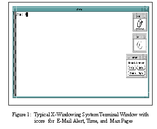
Although a separate GUI standard, many X-Window based GUI, such as Motif and TCL/TK, have copied the look and feel of the IBM SAA. X-Windows is still the underlying library for these GUI. The X-Windowing System is the most popular GUI for UNIX systems. This is because any X-Windows software can use the X-Windows library, which gives it great portability and standardization across platforms. Figure 1 illustrates a typical X-Windows GUI with three common icons.
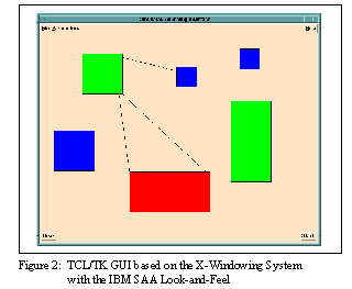
X-Windows also works directly with networks, which allows the GUI display to be on one computer and the application that the user needs on another computer. It does not matter if the two computers are in different rooms or on different continents. It addition to the three common GUI components, X-Windows has a collect of application tools and utilities as a built in X-Library. Figure 2 illustrates a TCL/TK GUI that uses the X-Library utilities. TCL/TK has the IBM SAA "look-and-feel."
Although GUI are an integral part of an application, GUIs are not inherently easier to use than command line interfaces. The quality of the design is the overriding issue for all interfaces [4][5]. There are several screen design guidelines. On the other hand, there is shortage of empirical studies substantiating these guidelines. This lack of empirical research is especially apparent for modern GUI designs, such as Windows '95, Quicken 7.0, and Dbase 5.
In a narrower sense, there are empirical studies that have identified basic psychological factors that one should consider in the design of good GUI. This paper will narrow the discussion to three primary contributing human factors, which are: the physical limits of visual acuity, the limits of absolute memory, and the Gestalt Principle.
Visual acuity is the ability of the eye to resolve detail. The retina of eye can only focus on about on a very small portion of a computer screen, or anything for that matter, at any one time [24]. This is because, at a distance greater than 2.5 degrees from the point of fixation, visual acuity decreases by half. Therefore, a circle of radius 2.5 degrees around the point of fixation is what the user can see clearly.
In the GUI world, this is the Rule of 1.7 [21]. At a normal viewing distance of 19 inches, 5 degrees translates into about 1.7 inches. Assuming a standard screen format, 1.7 inches is an area about 14 characters wide and about 7 lines high [11]. This is the amount of information that a user can take in at any one time, and it limits the effective size of icons, menus, dialogs boxes, etc. If the user must constantly move his eyes across the screen to clearly focus, the GUI design is causing a lot of unnecessary and tiring eye movement.
Once the user has a desired fixation point, there is a limit to the amount of information that the person can process at one time. A GUI design rule of thumb is that the range of options or choices should never be more than five or six [17][21]. Seminal work by Miller is the basis for this rule. Miller [17] showed that absolute identification using one-dimensional criteria was about seven items, plus or minus two. He showed that this limitation also held for memory span. Miller introduced the concept of recoding as a method that people use to store information. Miller also pointed out that by expanding the identification criteria from one to more dimensions people could handle more choices and remember more. Later researchers expanded on Miller recoding to develop the concept that people chuck information together in order to remember more information [2][23]. This research has direct impact on GUI design, especially concerning the number of menu items and icons.
The Gestalt Principle states that people use a top-down approach to organizing data [11][24]. This principle can influence how one should organize graphical information on the screen. The Gestalt school of GUI designers have attempted to identify criteria that cause people to group certain items together in a display. Proper grouping results in a necessary redundancy of selection information that aids the user. For example, if the user knows where one item in a group is on a screen, he will expect other like items to be there also. If one groups the items in line with this expectation, it allows for accurate locating and better transfer of information to the user.
The top-down approach also allows for the development of emergent features. An emergent feature is a global property of a set that is not evident when one views each item locally. Since global processing tends to be automatic, one can argue that an emerged feature reduces the attention demand as a user operates a multi-element display. For this performance enhancement, one must use the Gestalt Principle in the initial placement, and the resulting organization must be compatible with the user's cognitive view of the task [24].
Considering the above psychological factors, one could come to the conclusion that one could easily extrapolate these factors to the design of a good GUI. Empirical studies of GUI show that this intuition this is not always the case. The Rule of 1.7 directly leads to the conclusion that a good GUI would use a lot of icons. Unfortunately, too many randomly placed icons violate the limits of absolute memory. Using the Gestalt Principle, one can group like items together using factors like color to add more informational dimensions. Too many colors, however, destroy the global visual grouping of the items. The user then begins to concentrates on the GUI. Any primary cognitive task attention devoted to the interface may interfere with the primary task [19]. One can derive basis GUI standards from basic human factors, however. These standards are the presentation of information, the grouping of information, and information sequencing.
Amount of Information Presented
The amount of information to present is the most basic of GUI design considerations. H.E. Dunsmore [3][11][20]showed that making screens less crowded improves screen clarity and readability. As such, GUI designers usually follow the guidance that the interface should display only what the user needs to perform the current operation. Empirical researchers show that limiting the information to that necessary for the user reduces errors and time to perform tasks. Errors and performance time increase as the GUI presents more information. Of course, it requires a thorough analysis of the tasks that the user must perform in order to display only the necessary amount of information.
Compared to a randomly placed screen, a well-designed screen can reduce time needed to perform a task by as much as 40% [11][15]. Ways to conserve screen space are:
Given a set of information to display, there are many ways one can display the information. Proper grouping improves the information's readability and can highlight relationships between the information [11]. Tullis' [11][21] experiments in the mid-1980s showed that the best predictors of search time were the number of and size of the groups. Therefore, one should structure displays with the limits of visual acuity in mind. The user needs to be able to take in the different chunks of information at one glance to improve readability. Overall, the best predictors of ease of use were density and item alignment.
Empirical research shows that search time increases as the size of the grouping exceeds 5 degrees of arc and the number of groupings increases above five [11][24]. With groupings less than 5 degrees, the search duration is directly a function of the total number of groupings on the screen [11]. There are several techniques to aid in the grouping of information, which include:
One needs to lay out a screen in a manner that allows the user to easily find any information on it. Most designers advocate the use of one the de facto GUI screen standards. This is because many users now expect certain modes of operation in all GUI. For example, most users expect the top of screen to contain the headings for the pull-down menus. The top right is the default location for icons representing the disk availability. In the Macintosh GUI, the bottom right contains the trash icons used for deleting files.
Within a window, there are also many standard modes. A window title is usually at the top. Scroll bars are on the right and bottom for vertical and horizontal window movement. A box for closing the window is at the top left. Icons for resizing the window are at the four corners [11].
Studies show that most users initially scan the screen starting at the upper-left corner. This corner should be the obvious starting point for applications invoked from within the window. This permits a left-to-right and top-to-bottom reading, which is standard for Western cultures.
The optimum sequence for screen presentations is a collection of various factors, including:
The goal of any GUI is to allow the user to work through the computer and application to concentrate on the primary cognitive task. The user should not be concerned with the user interface. Any attention devoted to the interface interferes with the main task [4][19].
What are the ramifications of GUI design? One consistent result is that an increased operational knowledge transfer between applications reduces training costs [9]. Training costs are usually one to three times the cost of the actual software and hardware [3][7]. A good GUI design reduces required training time to 20-30 hours for a user to learn an application [8]. For businesses, this means that a good GUI saves money and time. Additionally, a good GUI improves the user's perception of the application. The user's first 15 minutes of usage formulates the lasting impression of an application [26].
The primary goal of a GUI is to allow the user to concentrate on the task at hand. To do this, the GUI must make the interface between the human and the computer seamless. Modern GUIs adhere to one of three de facto standards, which are the Apple Macintosh, the IBM SAA, and the MIT X-Windowing System. These standards are not perfect, but they are good enough to preclude major deviation. Future GUI will probably utilize one or more of these standards unless major performance enhancements result. Utilizing key psychological factors, GUI designers can achieve a seamless computer human interface.
The three primary human factors that directly affect GUI design are visual acuity, the limits of absolute memory, and the grouping of information. At about 19 inches from an object, a person's visual acuity is about 5 degrees of arc. There appears to be a limit to absolute memory of about 7 items. Grouping of information based on the Gestalt principle appears to aid in information processing.
Use of these factors result in GUI design principles that govern the amount of information to present, the proper way to group this information, and the proper placement and sequencing of this information on the screen. A good GUI should present information that is contextual and consistent. It should avoid unnecessary detail and use concise wording to conserve screen space. If familiar data formats exist, the GUI should utilize them.
A GUI needs to group information using color to associate like items. Graphical boundaries are a very effective means to group like items, especially icons. Other highlighting techniques include reverse video, brightness, underlining, and flashing.
One needs to sequence information on the screen to facilitate the user. The presentation of information should follow the sequence that the user needs it. Common information needs to be in common locations across windows and GUI. The most important information needs to precede the lesser important information. Frequently utilized information or commands need to be in the most prominent location. The more general items should precede the more specific items. If no other ordering exists, one should alphabetize.
The ramification of good GUI design results in reduced training time and improved performance. Reduced training time means lower costs and improved user perceptions. Bad GUI design prevents the user from concentrating on the primary cognitive task. This results in user frustrations, decreased performance, higher costs, and possibly product and marketplace failure.
When designing GUI, one need to keep the objectives of the GUI in mind and to generally avoid needless complexity [16]. One must avoid useless innovation [18] and concentrate on improvements that enhance performance. Future trends in GUI are toward voice recognition and hypertext format language [10][13][18]. The hypertext trend allows the user to move directly from data and concepts in one application to similar data and concepts in other application. These trends will further remove the GUI as an obstacle between the user and the task.
[1] Angus, Jeffrey G. Coding a Masterpiece. Infoworld. Vol. 16. No. 44:85-90.
[2] Baddeley, Alan. The Magical Number Seven: Still Magic After All These Years? Psychological Review. Vol. 101. No. 2:353-356.
[3] Bakewell, Catherine J. How to Choose a Usable System for General Practice. Journal of Management in Medicine. Vol. 7. No. 1:12-21.
[4] Benbasat, Izak and Peter Todd. An Experimental Investigation of Interface Design Alternatives: Icon vs. Text and Direct Manipulation vs. Menus. International Journal of Man-Machine Studies. Vol. 38:369-402.
[5] Betts, Mitch. Standard GUIs Make Sense. Computerworld. Vol. 28. No. 11:75-76.
[6] Bonsiepe, Gui. Interpretations of Human User Interface. Visible Language. Vol. 24. No. 3:262-285.
[7] Boeri, Roberts J. And Martin Hensel. Human Factors in Business CD-ROM Titles. CD-ROM Professional. Vol. 8. No. 2:107-108.
[8] Comaford, Christine. Graphical User Interfaces: Keep Them Sleek and Simple. Computerworld. Vol. 25. No. 16:37-40.
[9] Harding, Bruce A. Windows & Icons & Mice, Oh My! The Changing Face of Computing. Frontiers in Education Conference 1989: 19th Annual:337-342.
[10] Hayes, Frank and Nick Baran. A Guide to GUIs. Byte Vol. 4. (July 1989):250-257.
[11] Helander, Martin ed. Handbook of Human-Computer Interaction. New York: 1988.
[12] Hopkins, Don. Paper from The X-Windows Disaster. Undated from the UNIX Haters Web-Site.
[13] Horton, William. Visual Rhetoric for On-line Documents. IEEE Transactions on Professional Communication. Vol.33. No. 3:108-114.
[14] Hubona, Geoffrey S. Evaluating User Interface Design with Belief Constructs. Systems Sciences, 1995 Annual Hawaii International Conference. Vol.4:700-709.
[15] Lin, Yi_Bing and Dan Daly. A Flexible Graphical User Interface for Performance Modeling. MASCOTS 1994: Modeling, Analysis, and Simulation International Workshop:193-199.
[16] Marcus, Aaron. The Future of Advanced User Interfaces in Product Design. TRON Project, 1992 Symposium:14-20.
[17] Miller, George A. The Magical Number Seven, Plus or Minus Two: Some Limits on Our Capacity for Processing Information. Psychological Review. Vol.101. No.2:343- 352.
[18] Monkiewicz, James. CAD's Next-Generation User Interface. Computer Aided Engineering. Vol. 11. No. 11:50-56.
[19] Norman, Donald. The Psychology of Everyday Things. New York: Basic Books:1988.
[20] Reiterer, Harald. The Development of Design Aid Tools for a Human Factor Based User Interface Design. Systems, Man, and Cybernetics, 1993 International Conference:361-366.
[21] Sarna, David E. and George J. Febish. What Makes a GUI Work? Datamation Vol. 4. (July 15 1994):29f.
[22] Sears, Andrew. Layout Appropriateness: A Metric for Evaluating User Interface Widget Layout. IEEE Transactions on Software Engineering. Vol. 19. No. 7:707-720.
[23] Shiffrin, Richard M. and Robert M. Nosofsky. Seven Plus or Minus Two: A Commentary On Capacity Limitations. Psychological Review. Vol. 101. No. 2:357-361.
[24] Wickens, Christopher D. Engineering Psychology and Human Performance. 2d ed. Harpers: New York: 1992. p. 24-109, and 116-160.
[25] Unauthored. Windows95 Annoyances. http:// www.creativelement.com/win95ann. Dated 15 November 1995.
[26] Winograd, Terry. From Programming Environments to Environments for Designing. Communications of the ACM. Vol. 38. No.6:65-74. 26 27